Project
Rebranding of the corporate identity of the Nomad Oil gas station chain.
Task
Creating a relevant brand.
Increasing customer loyalty.
Increasing the company's position in the market among competitors.
Implementation
The project was implemented by order of VDS, the main manufacturer and supplier of advertising equipment.
NOMAD carries the spirit of the culture of the people, reflects the rhythm of life of drivers, constantly “roaming” from place to place on their iron horse.
That is why the image of a galloping horse was chosen for the logo - the main assistant and friend of the nomads.
The company "In Oil LTD KZ" is one of the leading networks of gas stations in the Kazakhstan market, operating since 2008 under the brand "Nomad Oil".
In the fall of 2021, she rebranded and changed the name of the network to a more laconic one - “Nomad” (“Nomad”). We chose brevity and catchiness, dynamics and incentive for constant development and movement forward.
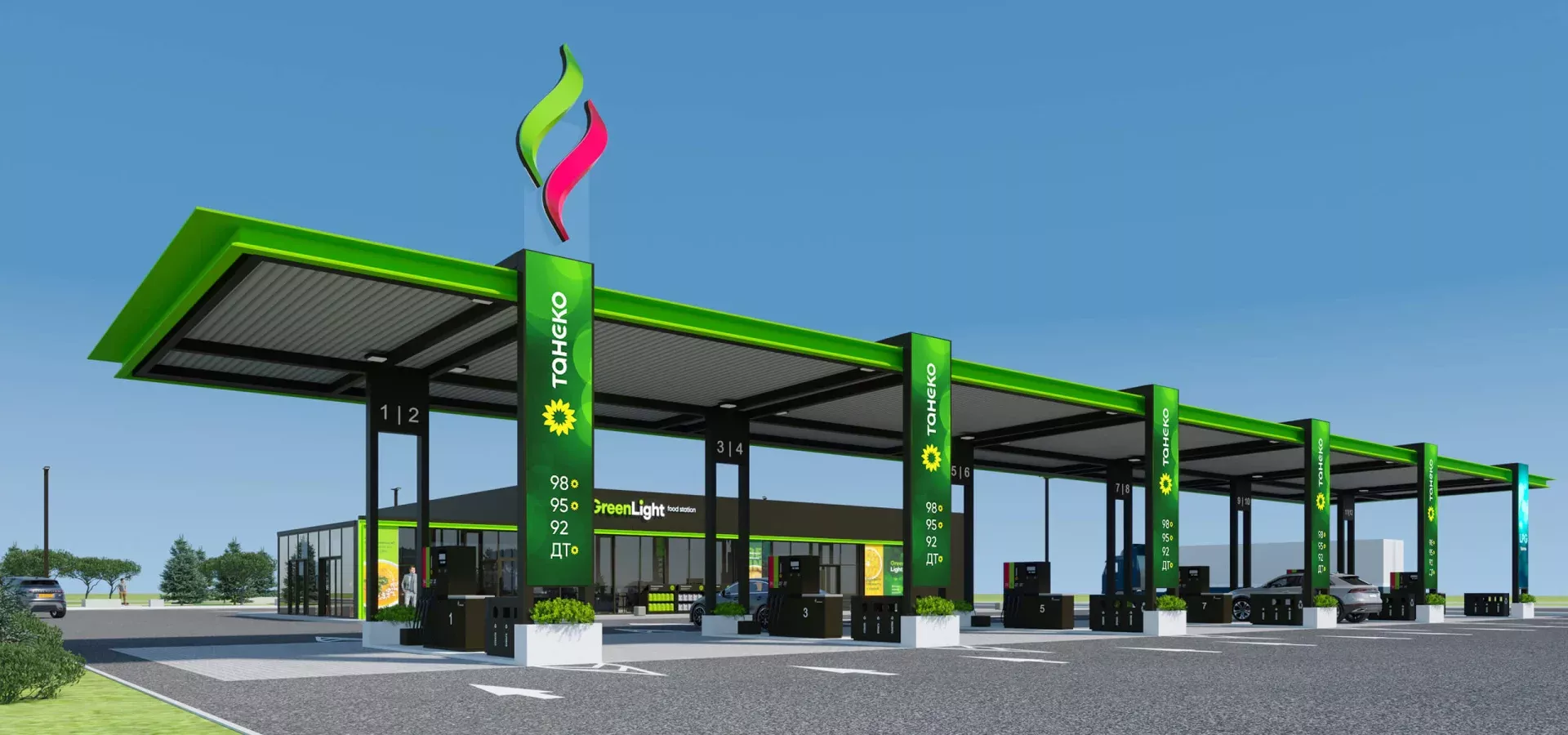
The new gas stations are made in light colors, which symbolizes openness and lightness, and the harmonious design of the exterior and interior of the station connects the space into a single whole.
Bright stations with cozy cafes attract attention and greet customers with an atmosphere of comfort and hospitality.